Data Visualization in Power BI and Beyond
Data Visualization in Power BI and Beyond is a Data Science YouTube channel with 3.1K subscribers. As of October 2026, it has published 26 videos with 88.4K total views (~2.4K per video), and a 2.16% engagement rate — top 48% of Data Science educators. It covers DAX, Power BI and uploads on an irregular basis.
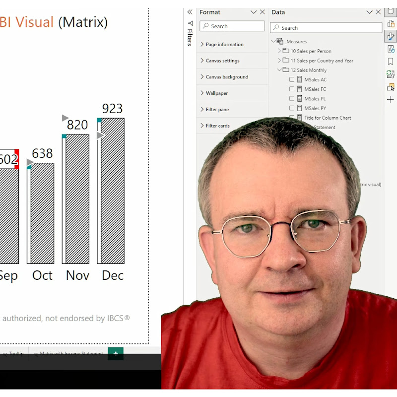
On this channel, I discuss data visualization in Power BI, highlighting Power BI's strengths and offering workarounds for its limitations. I dissect a simple pie chart to explain when it's a good choice and when it's not and I demonstrate how to use advanced techniques, such as Vega visualization grammar or SVG charts generated using DAX measures and calculated groups. Although I explore data visualization beyond Power BI and aspects of Power BI beyond data visualization. Whether you're a novic
Channel Statistics
Connect with Data Visualization in Power BI and Beyond
Verified email on file. Companies can request creator contacts for sponsorships & partnerships.
Technologies Taught
Similar Channels






More educators from Poland (51 channels) →
Content Style
30-Day Growth
Views Trajectory · last 77 days
+1.9% views (30d) — slower than its prior 30d (+2.5%), momentum decelerating
GitHub Profile
Featured Video
Data Visualization in Power BI and Beyond (@power-of-bi) is a data science YouTube channel with 3.1K subscribers. With 26 videos and 88.4K total views, the channel averages 2.4K views per video. Data Visualization in Power BI and Beyond has an engagement rate of 2.16%, placing it in the top 48% of data science educators on the platform. The channel uploads on a sporadic basis, making it a inactive creator in the developer education space. Data Visualization in Power BI and Beyond covers technologies including DAX, Power BI.